So two of my illustrations are finished, as finished as they can get right now at least. I might see some more flaws in them after a while or fix whatever might be wrong with them after getting some feedback from people. i have to say though that i am very pleased with certain elements, which I intend to describe further on.
Warden:
This one turned out a little different from the original sketch. I changed her hair because I felt that short and loose hair would be more fitting for this character than an ornate bun. I have changed the look of the shield quite a bit and the way the hand is holding the weapon. The belt is also a little different. Instead of a regular leather belt I opted for a braided multi colored looking belt.
The things I am particularly pleased with is the texture of her leather armor and the fur. I worked hard to make it look like thick leather or hide. The cloak also looks good I think, the added detail at the bottom really lifted the image. The shield turned out better than expected to be honest. What I did have some trouble with however was the skin. It ended up looking a bit too airbrushed, so if I get the time I'll read up on some tutorials and fix it.
I had some trouble with the "whooshing" sand in the background. I've never tried to paint sand like that ever, and I had no idea of how to do it. I basically just sat down and played around with some brushes, the eraser and the burn(dodge tool until it looked "whooshy" enough.
The elven sorcerer:
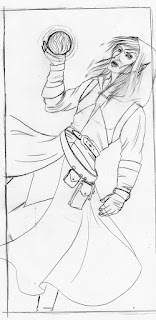
The sorcerer was a challenge I'll say that from the get go. He was difficult from the beginning of the sketching stage. It was fun to play around with the design of his robe and the accessories, but his pose and the flames raging around him were a nightmare to figure out for some reason. There are some extra details in this version too. There are embellishments on the gloves and belt that were not present in the sketch. The hair is also a bit different.
I am not a friend og light from several angles. I hate to consider light sources when working, but alas it is necessary isn't it. In this one it is a little tricky, since it is lighted from the back and from the front. I remembered reading in Imagine FX a little while ago that warm light will produce cold shadows and vice versa. That one trick really saved me, so thanks a bunch to Imagine FX for that one. The face was a bit tricky to get, but it turned up much better than the wardens did. It's more painterly looking instead of airbrushed. What I am proud of is the orb however. I think it looks awesome. I think I got the colors right, the texture looks about right, it just looks cool (at least I think so :p).
The flames is a chapter all to it self. It's hard to paint flames, that all I can say. I think I managed to do some convincing flames. They don't really look realistic, but neither does my personal style either. I think my style is sort of "cartoonie" with a touch of realism, if that makes sense at all.
I haven't shown these to my teachers yet, so I don't know what they think about them. I at leat feel like I'm doing a good job. For every piece I do I see personal progress in at least one area, and at the end of the day I think that's the most important thing, to evolve and develop ones style and technique.
Until next time
Anita Night


