Friday, September 28, 2012

My 5 egregious omissions in Fantasy Literature!

Today I am getting my geek on for real!

I was very entertained and inspired by a recent post made by Zachary Matzo over at Fantasy Faction.
He wrote a list of the top 5 fantasy reads he hadn't read. I thought it was a fun twist. He encouraged people to make their own versions of the list and since I love making lists (yes, I am fully aware that this makes me seem a bit odd), and since I do love love love fantasy literature I've decided to follow his lead and do a similar list.

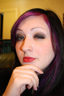
Please don't hold this very sensitive information against me, I'm only human after all (unfortunately, if I had it my way I would be an elf..or no wait, a vampire..I can't decide.)

This is me..deeply considering the implications of being an elf or a vampire


My top 5 egregious omissions:

1. A song of Ice and Fire by George R.R. Martin
- I know I am terrible. I should be hunted with pitchforks by angry villagers, but in my defense it's not really my fault. I tried reading it when I was 14 or 15. I couldn't afford buying the books so I had to borrow them at the local library , and every time I tried borrowing the damn books they were not available or I would get wait-listed. So there, blame my local library, not me.

2. The wheel of time- Did you think this list would be getting less embarrassing right about now? Well think again. I have tried and tried to read this entire series. I've gotten as far as to book 4 or something and then nothing. For some reason I just can't get past the fourth book. Once again blame my public library. Not to mention that each time I try to read it again it's been so long since the last time I read it that I have to start all over again. Maybe if someone gifted me with the entire series, maybe then I would be able to get through it (hint hint)....OK, not funny yet...


3. Sandman
- Like Mr. Matzo I have never really read the sandman comics at all. I have one comic about the character Death that I purchased by happenstance once, but I never got around to actually buying the proper Sandman series. Which is kind of annoying, considering I've read quite a lot of Neil Gaimans novels.

4. Alice in wonderland- To me this one is a bit like swearing in church. I can't really believe I haven't read this one at all. I've seen the movies, I know the story well, I even dressed up as Alice for Halloween one year (in a dreadful wig, that I will not be showing any of you any time soon). There just isn't any excuse.


5. Anne McCaffrey
- I have never read Anne McCaffrey either. I bought one of her novels at a used book sale, it's been sitting in my shelf collecting dust for at least 7 years. I've never opened it, I just bought it because it had a dragon on the cover. Alas I got sidetracked by Maggie Furey and her Shadowleague trilogy. What can I say, the cover art on Fureys books just spoke to me in a way that the McCaffrey covers never did. I'm a sucker for good art..and considering my profession I guess that piece of information was a bit obvious...

So there you have it, my top five egregious omissions..Please do feel free to share yours with me or with Mr. Matzo over at Fantasy Faction!

Just to make up for that awful list, here is a short list of literary awesomeness that I have read:

The Belgariad by David Eddings
The Legend of Deverry by Katherine Kerr
Sheepfarmers daughter by Elizabeth Moon
The collected works of Raymond E. Feist
Mistborn trilogy by Brandon Sanderson
Lord of the rings, the hobbit and Silmarillion by Tolkien
All the Harry Potter books
Dragonlance by Margaret Weis
Shadowleague by Maggie Furey
The Dark Matter by Phillip Pullman
Shannara trilogy by Terry Brooks
Sword of Truth by Terry Goodkind
you get the picture...

currently reading the Malazan book of the fallen  series by Steven Erickson, book seven, Reapers Gale.

Until next time
Anita K. Olsen

website:
www.anitaolsen.daportfolio.com

contact:
anitaolsen.illustration@gmail.com


Thursday, September 27, 2012

Personal development (draw this again)

Yes today we are talking about personal development, but not of the emotional kind.
Today I am focusing on the development of technical skill. Personally I am never truly 100% pleased with my artwork. I won't allow myself to be, because the moment you do you become complacent. My goal is to  keep learning, keep improving and keep working hard for as long as I live. I love to learn and I have always strived to become a better artist, or a better person or a better, well everything. So naturally every once in a while it is nice to see how far you've come.


Below you can see two images. The first one is an older illustration of mine. I made it a couple of years ago, and it was one of my first completely digital illustrations.


This week I decided to remake it in the spirit of Deviantarts current "draw this again" contest. The whole point of the contest was to choose and old image from your own Deviantart gallery and draw it again. I thought this sounded like a great challenge for me, and it would also allow me to see how much my skills had improved since I made the original Illustration.


As you can see the two illustrations have the same original design, but the details and the colors differ vastly.
I decided to create a greater contrast between the background and the pendant. In the first version the pendant had a golden color very similar to that of the background and seemed to blend in with it a bit. In the new one however I feel that the pendant pops more. Also the new version is more polished, and neat. The details are more refined and there is actually a proper background. In the original version I got the feeling that the necklace was just floating in thin air, but in the new version it is placed on a background of silk. This gives the image more visual interest and puts the necklace into context, it actually belongs somewhere now.


I could probably bore you with more details, but lucky for you I won't do that.

What I am going to do is encourage you to try this experiment for yourselves. How far have you come in the past two or three years? Have you pushed yourself? Have you been slacking? If you have improved vastly was it because you had a goal to do so or is it more happenstance? To find out do the challenge ;)

Until next time
Anita K. Olsen

website:
www.anitaolsen.daportfolio.com
 
contact:
anitaolsen.illustration@gmail.com

Sunday, September 23, 2012

How to create a logo?

Yeah, well I haven't been super good at updating this blog in the past few weeks. I have done it, but you know life keeps getting in the way.

Today I want to toot my own horn as it were. I am currently working on a gig. I am designing a logo for a business who works with seafood. It's not exactly what I usually do, but I have done it before on occasion. I'm getting into it more and more. It's an art unto itself to actually create a good logo that properly conveys the business behind it. I do however find it to be way easier to create logos for others instead of making one for myself. I think it has something to do with distance and perspective. Being on the outside I find it easier to pinpoint exactly what is special about another person or their respective business.

In the spirit of my new gig I thought I would give you all some pointers on how you should approach the process of creating a logo. My pointers is a mix of personal experience, the advice of other professionals or other sources as the interwebnets ;)


How to create a logo:

1. What do they want?
When you create a logo for someone it is always best to start with a meeting where you can discuss with your client, and get to know what it is they want. Sometimes a client doesn't know what they want at all, it then falls to you to figure out what that may be by asking questions about the business in question. what is it they need? How does the business want to be perceived? Do they want a logo with a symbol or do they just want one that is font based(just text)? What kind of colors do they want in their logo? The more details you can squeeze out of your clients the better.

2. Do the research!At this point you should research other logos that already exist out there. Specifically logos that are in the same field as the one you are about to design. By doing this you will get a clear idea of what is out there. You can see what others have thought about when faced with a similar challenge, and you can choose to be inspired by that or go in a completely different direction. One important point is that you can also avoid plagiarizing someones else's work by accident. After all great minds think alike!

3. Start sketching
After having met with your client and having looked at other logos you should have more than enough inspiration and concepts swimming around in your head. Now it's time to get them down on paper. You don't have to be very refined right now. The important thing is to get your ideas down on paper and not get too attached to any one given idea.

4. Develop!Ok, so you've developed some neat ideas now. You should choose some of the ideas you think stand out as the best concepts and develop them a bit more. Draw them cleanly, add some color and create a sense of what the logos would look like as a finished product.

5. Reviews and revisions
Once you are satisfied that your prototype logos are communicating your ideas properly you can send them to your clients for review. Let the client look at the logos and choose their favorites. If they are satisfied you can continue forwards in your process. It is much more common however that the client has some revisions in mind, like changing the colors, adding some details, using a different font, and so on. Based on the feedback given you revise your ideas. In the rare and frustrating event of the client not liking any of the suggestions you've made, you go back to the sketching process and start over or show them some of the ideas you scrapped earlier in the process. Hopefully the client will be satisfied the second time around.

6. Finishing up!
At this point both you and your client should be happy with the look of the logo. Now what you need to do is finish it up. Make the final product. Simple as that. Send the files to your clients and be sure to offer them help and customer service if it seems like they need it. A lot of small companies may be in need of some extra help when it comes to the use of their logo, copyrights and so on as they usually don't have a graphic design department or PR - rep. Helping your client like this leaves your client with a positive impression of you and this will make it more likely that they will recommend you to others.

Ok, so that was my quick guide to logo creation. It's a very general guide and you may find that you run into problems or specific terms that are unique to your specific assignment, but I believe that this is a good all purpose guide for those of you who want to take a stab at this specific field of illustration and design.

For more on this subject feel free to visit these pages:

http://www.entrepreneur.com/article/71902

http://justcreative.com/2008/01/08/how-to-design-a-logo/

Until next time!
Anita K. Olsen

www.anitaolsen.daportfolio.com

contact:
anitaolsen.illustration@gmail.com

Sunday, September 9, 2012

A couple of words on self-confidence

So lately I have been pondering a lot. I have been thinking about what it takes to be in the business of freelance illustration. It is a tough business, it's not for those who give up easily, or those who struggle a lot with self esteem issues.

I have also been thinking a lot about who I am and why I fit in to the business in certain ways and how I do not fit into the business in other ways. I do have rather large self-esteem issues, which is less than ideal. I've struggled with it all my life, even though a lot of people may not notice it. That's because I'm stubborn, and refuse to give up just because certain things makes me feel uncomfortable.

In the video below I talk about the subject of self - confidence, and share a simple tip on how you can start to build up your own confidence. It may be a bit long, but I think it's definitely worth the watch.

So enjoy episode 5 of Anita Illustrated:


Until next time
Anita K. Olsen