Thursday, May 12, 2011

I'm fine

So last night while burning that same midnight oil I had a surge of creative energy that just had to get out so instead of being a good girl and going to bed I stayed up drawing. I found a picture I had taken of myself a while ago(while I still had red hair) and used it as an inspiration. The look in the picture was a bit sad. It reminded me of how I look when I'm feeling depressed. It started a train of thought that lead to me thinking about what my fiancée usually asks when he can tell that I'm not doing to good. "Are you okay?" or "How are you feeling honey?". often I'll just say I'm fine. And then he'll look at me with a strict look on his face and remind me of what FINE means to him. "

Freaked out, Insecure, Neurotic and Emotional"

I swear that man knows more about me than I care to admit.

This is how the finished thing ended up looking:

the face was drawn by hand with pencil and a black felt tip pen. The pink paint splotches are watered down acrylic on watercolor paper, the font is a custom font named never let go, and the perforated holes on the side was a happy accident that occurred during scanning.


This is the original inspiration for the illustration. Ain't I just adorable (insert thick Texan accent or something) :p

As always do feel free to critique or comment upon my work.

Until next time
Anita Night

Wednesday, May 11, 2011

Sketch of the week

Yeah, I don't really do daily or weekly sketches but in the small hours of the night when my mind is burning viciously on that overused night oil it's hard to think too creatively when naming things. So hence the mind bogglingly clever title of this post.

On to the subject matter...I've drawn a baby..holding a rattle...with a skull painted on it...I don't really know why. Maybe it's because our friend Kim is visiting us and he has been talking over skype to his little baby boy. I'm not that into babies or kids in general to be honest, but seeing the little pudgy pink creature on my computer screen got me thinking..I don't know how to draw babies. I've not tried more than once to be honest. I am way to comfortable with the grown human figure so I thought that maybe by drawing anatomy that is slightly unfamiliar I might learn something valuable.


So I drew this. I did it without reference because my computer has been taken hostage on and of throughout the day. I didn't really mind. It was a challenge to try recollecting how babies are built just by trying to remember the shape of my little brothers and sister. As a first attempt I am willing to say that it's not too shabby. My next step will be trying to draw a baby while using reference material. I wonder how great the difference will be. It would be fun to do this as a little side project :P

So stay tuned for some more surprising... baby art!? :p

Until next time
Anita Night

Tuesday, May 10, 2011

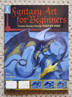
Book review-Fantasy art for beginners by Jon Hodgson

Like most artists and illustrators will tell you, you can never have enough reference books or art books. Having a good library is essential. Mine is not that large, and not too extensive to be honest. Right now it consists of a giant, messy, uncategorized heap of personal reference photos hidden in the dingy little cavern that is my Computer disc. I have one anatomy book(too many superhero proportions in it for my personal taste so I need a new one) A how to be an illustrator book by Darrel Rees a stack of the lovely ImagineFX, a guide to fantasy art, an art book by a woman whose name I forget, some rpg books and Fantasy Art for beginners by Jon Hodgson, which is the book of the day.

Fantasy Art for beginners is a lovely little paperback book from Impact press. And shows the reader how Jon Hodgson creates artwork step by step from little stick figures to fully rendered finished illustrations.

This book is truly aimed at beginners, but I believe that intermediates could still find some useful tips or tricks from it. And even if you aren't really interested in the tutorials the artwork in itself makes this a good buy.
The book kicks of with an introduction to fantasy art, what it's all about. It gives you a list of accomplished illustrators whose artwork one should check out. i then jumps to explaining a little bit about the tools of the trade both traditional and digital. Something that especially young artists who may not be very well versed in the use of these tools will find practical. There are also sections dedicated to use of light, composition and color. very handy for the beginner levels.

The subjects presented in the book are easy to read through, not too heavy and long winded, but thourogh enough to give the reader a basic understanding.

I already knew most of the things described in the chapters, but it is amazing how many things you can forget over the course of a year so refreshing ones knowledge is never a waste of time.

The sections I enjoyed the most were the last ones. The parts where we get to see Jon's art evolve from a meager beginning to a rich and textured end.

Below you can see pictures of the pages where Jon is creating a heroine who has just slain a Wyvern.
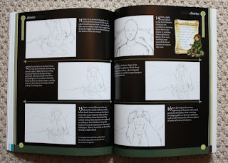
The way he works up layers of color and texture is to me especially interesting because it is something I never really tried before, but as soon as I get my hands on a copy of Corel Painter 11 I most certainly will. Photoshop just doesn't cut it for that kind of approach.
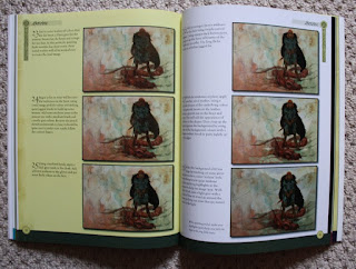
Skippoig ahead a bit here to a stage where the female warrior has gotten some flesh on her bones and some lovely armor.
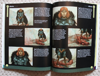
And on to a nice full page depiction of the finished piece.
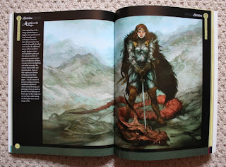
A recommended read for any young aspiring fantasy illustrator. Thanks a lot Jon and impact for a lovely and highly practical book.

If you are interested in purchasing this book after reading the review the book can be found on play.com here. for £8,63.

Until next time
Anita night.

Thursday, May 5, 2011

Fuchsia Injection

I did this image as a practice portrait. i needed to touch up on my faces. I often end up drawing faces that look very similar and sometimes quite flat. I found a very nice stock image on deviantart by Chamberstock that inspired me I just sat down and got to it. You don't improve without practice, easy as that.

At least I don't :p

I simply did a quick sketch on top of the stock image and then I removed the stock image. After that I started coloring the skin, choosing the right hues and blending. I am not a very efficient blender. It takes me a while to get it right, so it was good practice for me really. I had some trouble with the proportions of the face and had to refer back to the original image quite a lot but I finally got it somewhat right. The hair was a bit tricky too, but as soon as I figured out some neat tricks it went pretty smoothly.


If you have any constructive critique or comments about it feel free to leave a comment below.

Until next time
Anita Night