Hi all!
I got to thinking the other day about the fact that I have been on Deviantart for years, but I've never really made the effort to reach out to the community there. I've sort of just been hanging around not doing much.
I want to change that so I'm reaching out to you now. If any of my readers are on DeviantArt and want to
connect with me there you are very welcome! You can click the link below and it will take you to my one and only DeviantArt profile.
Anita's DeviantArt!
I put up a lot of things on that profile, stuff I wouldn't keep around in my professional portfolio so it's quite interesting to see the development of my artistic skills through the years :)
That's all I had to share with you this time but never fear I will be back soon with more quirkyness
or art or useful adult advice!
Until next time
Anita K. Olsen
contact:
anitaolsen.illustration@gmail.com
website:
www.anitaolsen.daportfolio.com

Showing posts with label autumnends. Show all posts
Showing posts with label autumnends. Show all posts
Tuesday, November 20, 2012

Wednesday, May 9, 2012
Follow me onTwitter!
Yes I have now opened a twitter account. If you are on Twitter(which you probably are) and you like reading up on what I'm up to then follow my channel there for little updates on my current projects and thoughts. you can fin my channel
Here!
Enjoy the everyday marvels that sneak out of my marble .
Until next time,
Anita K. Olsen
Here!
Enjoy the everyday marvels that sneak out of my marble .
Until next time,
Anita K. Olsen
Friday, April 20, 2012
Brochure Design
I have been wanting to make something nice that I can send to clients or leave behind at conventions or portfolio viewings. I already have a postcard and some old business cards, but I feel like they are outdated, they don't represent me and my business in the best way possible. Besides, I also wanted something a little different and more exclusive looking than just a postcard.
So as you might have guessed I chose to go for a brochure (see design below). It gave me more room to play around with, room for practical information and a few examples of my work and a proper design. Usually a brochure would be made in a standing format, but I kind of like the idea of a lying(landscape) format, so my design differs a bit from what you would usually see. I will also have some new business cards printed up and maybe some new postcards. We'll just have to see what I can afford.


I want to show my potential customers that I have a cohesive business profile, that I am indeed a professional. That's why the design of my brochure matches my blog design and the coloring of my temporary website. It just seems more professional when things look like they belong together and like it was made by the same person.
The brochures are already in the mail and as soon as they arrive I will post the result on the blog. Now if I have inspired you in some mysterious way to print up some of your own promotional material here are a few on-line print companies that can help you along th way!
www.moo.com
This company offers to print business cards, post cards, labels and stickers. A lot of companies do the same, but the nice thing about these guys is that they offer the option to print several different designs in the same print run so you don't have to blow all your money on one design if you don't want to. They are supposed to be affordable too so definitely worth a shot.
vistaprint.no
This is a norwegian site. They offer everything from t-shirts, banners, caps, mugs, business cards, note pads. Pretty much anything you could want. They are not that expensive unless you want your items delivered very quickly so order things in good time to save a bit of money. They offer free design templates or you can use your own images, they do charge for uploading your own images though, but right now they have a campaign going where the uploading is free.
blurb.com
If you really want to go over the top and don't mind spending a bit of money then this is the site for you. You can order professional quality books in full color with high end paper. Great for a portfolio or if you want an amazing leave behind for the clients you really want to impress.
for a more in-depth article on the leave behind/promotional item please visit this article written by Jon Schindehette over at the ArtOrder as it is a wonderful article on the subject and he knows what he is talking about.
Until next time
Anita K. Olsen
So as you might have guessed I chose to go for a brochure (see design below). It gave me more room to play around with, room for practical information and a few examples of my work and a proper design. Usually a brochure would be made in a standing format, but I kind of like the idea of a lying(landscape) format, so my design differs a bit from what you would usually see. I will also have some new business cards printed up and maybe some new postcards. We'll just have to see what I can afford.


I want to show my potential customers that I have a cohesive business profile, that I am indeed a professional. That's why the design of my brochure matches my blog design and the coloring of my temporary website. It just seems more professional when things look like they belong together and like it was made by the same person.
The brochures are already in the mail and as soon as they arrive I will post the result on the blog. Now if I have inspired you in some mysterious way to print up some of your own promotional material here are a few on-line print companies that can help you along th way!
www.moo.com
This company offers to print business cards, post cards, labels and stickers. A lot of companies do the same, but the nice thing about these guys is that they offer the option to print several different designs in the same print run so you don't have to blow all your money on one design if you don't want to. They are supposed to be affordable too so definitely worth a shot.
vistaprint.no
This is a norwegian site. They offer everything from t-shirts, banners, caps, mugs, business cards, note pads. Pretty much anything you could want. They are not that expensive unless you want your items delivered very quickly so order things in good time to save a bit of money. They offer free design templates or you can use your own images, they do charge for uploading your own images though, but right now they have a campaign going where the uploading is free.
blurb.com
If you really want to go over the top and don't mind spending a bit of money then this is the site for you. You can order professional quality books in full color with high end paper. Great for a portfolio or if you want an amazing leave behind for the clients you really want to impress.
for a more in-depth article on the leave behind/promotional item please visit this article written by Jon Schindehette over at the ArtOrder as it is a wonderful article on the subject and he knows what he is talking about.
Until next time
Anita K. Olsen
How to promote your illustration business?
I have been pondering how to promote my business quite a lot recently, because let's be honest without promotion there will be no jobs. I think a lot of us young, up and coming artists struggle with this. We are not business graduates, most of us have never studied economics or business management or anything remotely similar to it before we jump into the shark infested waters of the illustration business. So what the hell are we supposed to do once we have gotten ourselves into this position?

Message in a bottle. A fun and eye-catching way of promoting your business!(image found on google)
On paper the answer is easy and straightforward in some ways, but in reality it really isn't. There are countless ways of promoting your business both traditionally and in unconventional ways. Traditionally business cards and postcards seem to be the people's choice because it's usually cheap and they are easy to bring along with you or pop into a mailbox. More modern ways of promoting yourself is purchasing ads on-line or sending out e-mails to editors. A couple of years ago stickers seemed to be popping up everywhere promoting bands, artists or events, and I think that it may actually be a good way of promoting your stuff. Some people handcraft amazing give- aways like origami business cards, bookmarks, little booklets, flower seed packets and so on and so forth. Sometimes it may feel like you have to try to outdo all the artists around you just to get a clients attention. At least I often feel the pressure to do so. That doesn't work however. If you just set out to outdo others you'll usually end up with something that isn't quite you, something that doesn't really describe what you do. That's a horrible trap to fall into.

Origami ninja star business cards? Sure to be a killer at the office. (Image found at crddsgn.com)
I usually send out e-mails, it's my chosen weapon. I struggle with a bit of social awkwardness and anxiety at times and an e-mail is just so much easier on my nerves than a phone call or a personal meeting. Life isn't supposed to be easy though. Sending out e-mails doesn't always give results or answers at all and it's just plain stupid to rely on them as the only promotional item in your arsenal.
E-mails can often seem impersonal and effortless, and let's face it, most art directors must receive half a dozen e-mails every day from young hopefuls. So unless your art is super fantastically awesome you have to find some way to stand out in the crowd. That's the tricky part. I haven't tried ads yet or sending out postcards, or calling art directors to set up portfolio viewings because it has just been too damn scary, but that is about to change.
Over the next few months I will be sending out promotional material and buying on-line ads. I am going to see if it has any effect on my current work flow and I will be writing about my experiences on this blog. So stay tuned as I attempt to delve into the deep dark currents that is self - promotion.

A new and interesting design can really bring a brochure to life. (found at topdesignmag.com)
If there is anything in particular you would like me to write about then please do leave a little comment or question, and I'll see what I can do about it.
Until next time
Anita K. Olsen

Message in a bottle. A fun and eye-catching way of promoting your business!(image found on google)
On paper the answer is easy and straightforward in some ways, but in reality it really isn't. There are countless ways of promoting your business both traditionally and in unconventional ways. Traditionally business cards and postcards seem to be the people's choice because it's usually cheap and they are easy to bring along with you or pop into a mailbox. More modern ways of promoting yourself is purchasing ads on-line or sending out e-mails to editors. A couple of years ago stickers seemed to be popping up everywhere promoting bands, artists or events, and I think that it may actually be a good way of promoting your stuff. Some people handcraft amazing give- aways like origami business cards, bookmarks, little booklets, flower seed packets and so on and so forth. Sometimes it may feel like you have to try to outdo all the artists around you just to get a clients attention. At least I often feel the pressure to do so. That doesn't work however. If you just set out to outdo others you'll usually end up with something that isn't quite you, something that doesn't really describe what you do. That's a horrible trap to fall into.

Origami ninja star business cards? Sure to be a killer at the office. (Image found at crddsgn.com)
I usually send out e-mails, it's my chosen weapon. I struggle with a bit of social awkwardness and anxiety at times and an e-mail is just so much easier on my nerves than a phone call or a personal meeting. Life isn't supposed to be easy though. Sending out e-mails doesn't always give results or answers at all and it's just plain stupid to rely on them as the only promotional item in your arsenal.
E-mails can often seem impersonal and effortless, and let's face it, most art directors must receive half a dozen e-mails every day from young hopefuls. So unless your art is super fantastically awesome you have to find some way to stand out in the crowd. That's the tricky part. I haven't tried ads yet or sending out postcards, or calling art directors to set up portfolio viewings because it has just been too damn scary, but that is about to change.
Over the next few months I will be sending out promotional material and buying on-line ads. I am going to see if it has any effect on my current work flow and I will be writing about my experiences on this blog. So stay tuned as I attempt to delve into the deep dark currents that is self - promotion.

A new and interesting design can really bring a brochure to life. (found at topdesignmag.com)
If there is anything in particular you would like me to write about then please do leave a little comment or question, and I'll see what I can do about it.
Until next time
Anita K. Olsen
Thursday, April 19, 2012
Mighty Muggs
If any of my readers follow the ArtOrder blog, run and written by the fantabulous Jon Schindehette you might remember the recently finished Mighty Muggs challenge. The challenge was about designing a well known Dungeons & Dragons character/type on a Mighty Mugg figure. For those of you who have never seen one this is what a Mighty Mugg looks like:

I had decided to enter, but due to some family problems I wasn't able to finish my entry on time and had to miss out on it. Sad, but ah such is life. Anywhoot, I decided to finish my entry and post it her on my blog. I don't like letting a good effort go to waste and I was quite pleased with my concept as well.
So here you go guys, a sorceress inspired Mighty Mugg figure:

The plan was to paint most of her with acrylic paint. I was however planning to make her skirt out of shiny green organza. I was considering tulle but it's such a stiff material and it would be troublesome to work with. The decorations on her arms, outfit and hair was going to be green sequins. her hair I was planning to make from curly angel hair that you can buy in pretty much any craft store. Unfortunately that hair usually only comes in blonde colors so I would probably have to dye it or go online to find something in the right color.Not that it matters too much anymore, but I'm tempted to order the figure and make the sorceress anyway. We'll see :P
Until next time,
Anita K. Olsen
P.S. Don't forget to visit my online portfolio!

I had decided to enter, but due to some family problems I wasn't able to finish my entry on time and had to miss out on it. Sad, but ah such is life. Anywhoot, I decided to finish my entry and post it her on my blog. I don't like letting a good effort go to waste and I was quite pleased with my concept as well.
So here you go guys, a sorceress inspired Mighty Mugg figure:

The plan was to paint most of her with acrylic paint. I was however planning to make her skirt out of shiny green organza. I was considering tulle but it's such a stiff material and it would be troublesome to work with. The decorations on her arms, outfit and hair was going to be green sequins. her hair I was planning to make from curly angel hair that you can buy in pretty much any craft store. Unfortunately that hair usually only comes in blonde colors so I would probably have to dye it or go online to find something in the right color.Not that it matters too much anymore, but I'm tempted to order the figure and make the sorceress anyway. We'll see :P
Until next time,
Anita K. Olsen
P.S. Don't forget to visit my online portfolio!
Saturday, February 11, 2012
Art Evolution- Lyssa the White Wizard
I just sent my final version of Lyssa the white wizard to Jon Schindehette over at ArtOrder.com. I made her for the very exciting "Evolution" challenge. The basic rules were that you had to make your own version of a young human female wizard with black hair, dressed in white and gold. For further info on the contest and the project that originally started it all please visit www.theartorder.com.
Since the challenge is called the "Evolution" challenge I thought that it would only be natural to show all of my readers step by step how my submission evolved from sketch to finished illustration. This is going to be a post heavy on text and heavy on pictures, and hopefully people will find it enjoyable and informative.
Now, let's get to the step by step "tutorial" or whatever one might fancy calling it:
Step 1:
I drew a sketch on regular printer paper, that's pretty much how I do most of my sketches. I find it practical. I scanned the finished sketch and opened it in Photoshop where I multiplied the layer the sketch was on and added a layer below the sketch layer. I decided to lay some background color to sett the general mood of the piece and ended up with a stormy purple.

Step 2:
In this image you can see that I've started working on the skin and the face in general. I'm not really happy with the general build of her face. It looks a bit lop-sided and the proportions are of. Beyond that I'm happy with the color of the skin and the texture of it. I started working on the skin in a medium flesh tone, I used darker tones of pink and white here and there and some dark browns on the areas where I needed a darker shadow.

Step 3:
After finishing most of the skin I decided to leave it alone for a while and start working on the dress for a bit. Since the dress had to be white I can pretty much choose to use any kind of white I like, like eggshell white or whatever. I chose to use snow white as my basic dress color. I just loved the nice sharp contrast of the white with the purple background. For the shading of the dress I decided to go with a purplish blue to reflect the background color. Her hair had to be black so of course I gave her black hair, but with a tint of blue to make the hair more interesting and more natural looking.
At this point I realize that I am not happy with the build of her chest either. The boobs are too high up, they look odd and I'm not very happy with the cut of neckline.

Step 4:
As you can see a lot of things have happened in this image. The skirt has been colored in a golden/beige shade of white. I thought it would look pretty that way, but the contrast between that shade the stark white shade just made the image look messy so I'll be changing the color of the skirt. There are too many folds too, its straining on the eye so I'll have to do something about that too.
I've moved her boobs a bit further down, I've also covered those puppies up a bit. In general I don't find a lot of cleavage attractive at all.
I've given her some fresh and fun turquoise tights with some swirly golden effects. It gives the outfit a hint of modern day fashion in my opinion. All the areas that are colored yellow will be turned into golden trims and accessories later in the process.

Step 5:
I'm still not happy with the face, but I have adjusted the shape of it, added a deeper shadow under her chin. I also decided to redraw the eyes, I moved the lips also and reshaped them a bit. I think these adjustments made her face look younger and more expressive.
a href="https://blogger.googleusercontent.com/img/b/R29vZ2xl/AVvXsEjL1yanfN-wg2oeO6Zooen7dpaLXp3obLHSMW7-kBHK_luE7Z_61zdDrz_93fOb_9k9PhXtgSibCKXhHHWue8w7kkKfrZjB7_B07fd61n4Dyd9ksuI5drkHQGcGvw_aEvTlEkywQpfzm4E/s1600/Lyssa+wip+5.jpg">
Step 6:
At this point I have chosen to airbrush out some of the details in the dress and to give her skin a smoother look. The dress has been given some more blue shadows, the skirt has a cleaner white shade to it and the whole ensemble feels more cohesive than it did before.

Step 7:
Once more there is quite a leap in the process. Most of the golden trims have been finished, in addition I've given her a turquoise and gold necklace. I felt that the tights were a bit lonely. It stood out to much and there was nothing else in the image that could pick up that color. later I will add some earrings too, to break up the blackness of her hair.
I have also added a magical lightning effect arcing from her hand to her wand. It adds a lot of movement I think, and since I chose to do the effect in yellow and orange it gives it a nice complementary contrast with the purple background.

Step 8:
There is not much left to do now. A few details and some nitpicking remains. The wand has been colored in, the face has been worked on some more, I've added some yellow reflections on her skin and her clothes, since I figured the magic lightning would probably cast a bit of light. The hair has also been tended to, I've cleaned it upp a bit and made it a bit softer.

Step 9:
I was actually going to leave the illustration like that, but I realized that the character looked silly just floating about in a purple vacuum so I added some grass and changed the background color so it looked more like regular blue sky. I took a break for a few days and when I came back to the drawing I realized that her neck was a bot long, her eyes were still not to my liking and so on and so forth, so in short I made quite a bit of changes.

And in the end this is what the final image looks like:

Hope you found this entertainig or useful or both.
Until next time
Anita Night a.k.a Anita K. Olsen
Since the challenge is called the "Evolution" challenge I thought that it would only be natural to show all of my readers step by step how my submission evolved from sketch to finished illustration. This is going to be a post heavy on text and heavy on pictures, and hopefully people will find it enjoyable and informative.
Now, let's get to the step by step "tutorial" or whatever one might fancy calling it:
Step 1:
I drew a sketch on regular printer paper, that's pretty much how I do most of my sketches. I find it practical. I scanned the finished sketch and opened it in Photoshop where I multiplied the layer the sketch was on and added a layer below the sketch layer. I decided to lay some background color to sett the general mood of the piece and ended up with a stormy purple.

Step 2:
In this image you can see that I've started working on the skin and the face in general. I'm not really happy with the general build of her face. It looks a bit lop-sided and the proportions are of. Beyond that I'm happy with the color of the skin and the texture of it. I started working on the skin in a medium flesh tone, I used darker tones of pink and white here and there and some dark browns on the areas where I needed a darker shadow.

Step 3:
After finishing most of the skin I decided to leave it alone for a while and start working on the dress for a bit. Since the dress had to be white I can pretty much choose to use any kind of white I like, like eggshell white or whatever. I chose to use snow white as my basic dress color. I just loved the nice sharp contrast of the white with the purple background. For the shading of the dress I decided to go with a purplish blue to reflect the background color. Her hair had to be black so of course I gave her black hair, but with a tint of blue to make the hair more interesting and more natural looking.
At this point I realize that I am not happy with the build of her chest either. The boobs are too high up, they look odd and I'm not very happy with the cut of neckline.

Step 4:
As you can see a lot of things have happened in this image. The skirt has been colored in a golden/beige shade of white. I thought it would look pretty that way, but the contrast between that shade the stark white shade just made the image look messy so I'll be changing the color of the skirt. There are too many folds too, its straining on the eye so I'll have to do something about that too.
I've moved her boobs a bit further down, I've also covered those puppies up a bit. In general I don't find a lot of cleavage attractive at all.
I've given her some fresh and fun turquoise tights with some swirly golden effects. It gives the outfit a hint of modern day fashion in my opinion. All the areas that are colored yellow will be turned into golden trims and accessories later in the process.

Step 5:
I'm still not happy with the face, but I have adjusted the shape of it, added a deeper shadow under her chin. I also decided to redraw the eyes, I moved the lips also and reshaped them a bit. I think these adjustments made her face look younger and more expressive.
a href="https://blogger.googleusercontent.com/img/b/R29vZ2xl/AVvXsEjL1yanfN-wg2oeO6Zooen7dpaLXp3obLHSMW7-kBHK_luE7Z_61zdDrz_93fOb_9k9PhXtgSibCKXhHHWue8w7kkKfrZjB7_B07fd61n4Dyd9ksuI5drkHQGcGvw_aEvTlEkywQpfzm4E/s1600/Lyssa+wip+5.jpg">
Step 6:
At this point I have chosen to airbrush out some of the details in the dress and to give her skin a smoother look. The dress has been given some more blue shadows, the skirt has a cleaner white shade to it and the whole ensemble feels more cohesive than it did before.

Step 7:
Once more there is quite a leap in the process. Most of the golden trims have been finished, in addition I've given her a turquoise and gold necklace. I felt that the tights were a bit lonely. It stood out to much and there was nothing else in the image that could pick up that color. later I will add some earrings too, to break up the blackness of her hair.
I have also added a magical lightning effect arcing from her hand to her wand. It adds a lot of movement I think, and since I chose to do the effect in yellow and orange it gives it a nice complementary contrast with the purple background.

Step 8:
There is not much left to do now. A few details and some nitpicking remains. The wand has been colored in, the face has been worked on some more, I've added some yellow reflections on her skin and her clothes, since I figured the magic lightning would probably cast a bit of light. The hair has also been tended to, I've cleaned it upp a bit and made it a bit softer.

Step 9:
I was actually going to leave the illustration like that, but I realized that the character looked silly just floating about in a purple vacuum so I added some grass and changed the background color so it looked more like regular blue sky. I took a break for a few days and when I came back to the drawing I realized that her neck was a bot long, her eyes were still not to my liking and so on and so forth, so in short I made quite a bit of changes.

And in the end this is what the final image looks like:

Hope you found this entertainig or useful or both.
Until next time
Anita Night a.k.a Anita K. Olsen
Monday, January 30, 2012
Vampires mark 1
I did a practice piece in black and white today. I'm not good at drawing several people in one image so I thought I would practice that as well. It was kind of fun to work without colours again too.
I painted the whole thing in one layer, so there was little room for my usual tricks and shortcuts which was a nice challenge.
I've been dreaming of submitting a portfolio to white wolf for some time, but alas my portfolio does not have a lot of black and white illustrations, and not really any images with relevant themes. I intend to fix that, that's why I've started with this practice regime. In the hopes that I'll be able to strike illustrative gold sooner or later :P

Until next time
Anita Night
I painted the whole thing in one layer, so there was little room for my usual tricks and shortcuts which was a nice challenge.
I've been dreaming of submitting a portfolio to white wolf for some time, but alas my portfolio does not have a lot of black and white illustrations, and not really any images with relevant themes. I intend to fix that, that's why I've started with this practice regime. In the hopes that I'll be able to strike illustrative gold sooner or later :P

Until next time
Anita Night
Sunday, January 22, 2012
Lichy goodness
So...it's been a while since I had the time, the energy and the opportunity to do anything creative. After living like homeless bohemians for almost six months we finally got an apartment, we moved in in the beginning of January, yes this month. Things have been crazy at work as I've been working full time to make up for the fact that one of the full time employees quit around new years and of course no one in the management section had thought to bring in a temp. So I'm pretty much six months behind on my great scheme. My business should have been up and running by now, but such is life, things rarely turn out how you want them to.
It's been kind of hard on my motivation. It wavers every now and then. I'm not giving up on anything of course. It's just taking me longer to get where I want to be is all. That being said it still annoys the hell out of me!
Anyway, I finally had a whole weekend of, so I decided to find an old sketch from my digital archives. The choice fell on an image of a Lich standing at the mouth of a cave. Oh joy, oh joy, I love classic fantasy themes.

I think Liches are a ton of fun even if my favorite subject usually is pretty girls in cool outfits. A lot of Lich images tend to be rendered in dark colors, those colors usually being red or purple with a whole lot of grey and black and some poisonous-looking green glowing magical light or something like that. Leather and torn capes or cloaks seem to be an artist favorite as well. And usually I would be all on board with that, but this time I wanted to experiment with color and make something that looked a bit more organic. Not that I think liches and the undead can truly be organic, but Liches don't all look alike. I wanted my lich to look like he or she could have been a Shaman or a druid of some sort when he/she was alive and kicking. Hence the fur and the bird skull and the beaded headdress and the ochre colored robe. The lich seems to be welcoming you or waiting for you at the mouth of the cave. The evil grin on his face bodes ill for whoever enters his domain.
Maybe I succeeded maybe I didn't, but that was the idea I was going for. It's up to you to decide.
Until next time
Anita Night
It's been kind of hard on my motivation. It wavers every now and then. I'm not giving up on anything of course. It's just taking me longer to get where I want to be is all. That being said it still annoys the hell out of me!
Anyway, I finally had a whole weekend of, so I decided to find an old sketch from my digital archives. The choice fell on an image of a Lich standing at the mouth of a cave. Oh joy, oh joy, I love classic fantasy themes.

I think Liches are a ton of fun even if my favorite subject usually is pretty girls in cool outfits. A lot of Lich images tend to be rendered in dark colors, those colors usually being red or purple with a whole lot of grey and black and some poisonous-looking green glowing magical light or something like that. Leather and torn capes or cloaks seem to be an artist favorite as well. And usually I would be all on board with that, but this time I wanted to experiment with color and make something that looked a bit more organic. Not that I think liches and the undead can truly be organic, but Liches don't all look alike. I wanted my lich to look like he or she could have been a Shaman or a druid of some sort when he/she was alive and kicking. Hence the fur and the bird skull and the beaded headdress and the ochre colored robe. The lich seems to be welcoming you or waiting for you at the mouth of the cave. The evil grin on his face bodes ill for whoever enters his domain.
Maybe I succeeded maybe I didn't, but that was the idea I was going for. It's up to you to decide.
Until next time
Anita Night
Sunday, November 27, 2011
Bejeweled
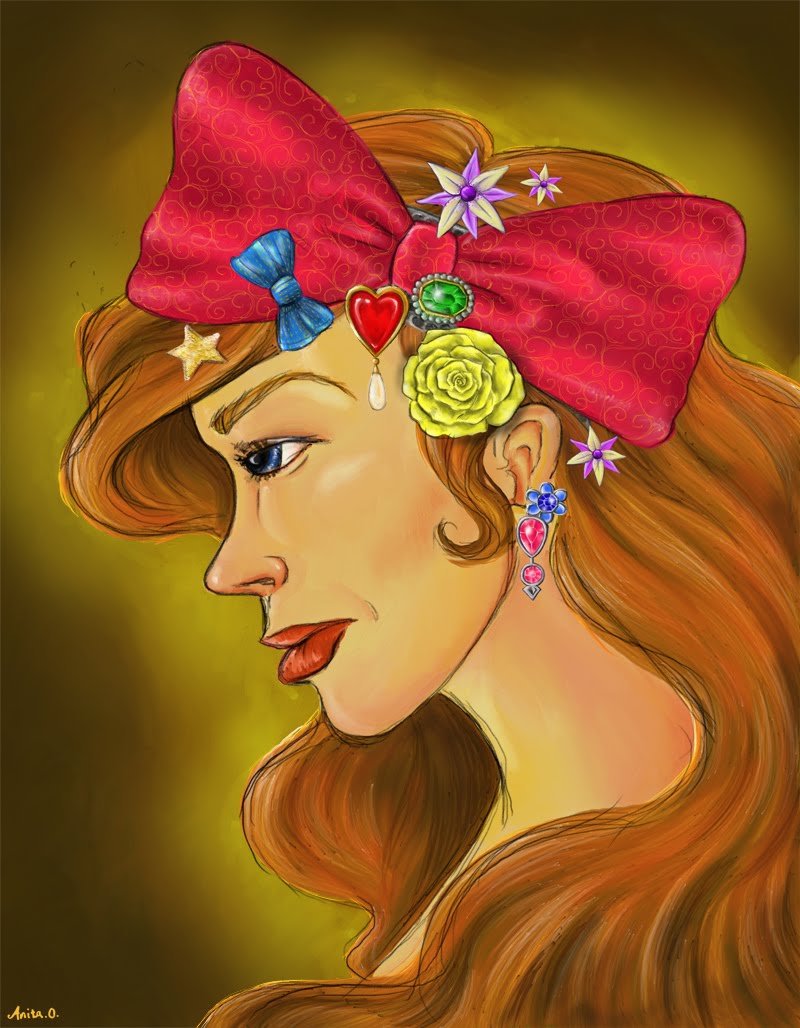
So a new update,
it's not a big philosophical work or anything, just thought I'd have some fune while exploring my new copy of ArtRage3 Studio.
Lots of fun!

I'm pretty happy with the skin and the general build of the face. The texture on the bows looks pretty good too. I'm looking forward to making a new illustration. Maybe something with a monster of some sort. I don't do enough of that.
Until next time
Anita Night
it's not a big philosophical work or anything, just thought I'd have some fune while exploring my new copy of ArtRage3 Studio.
Lots of fun!
I'm pretty happy with the skin and the general build of the face. The texture on the bows looks pretty good too. I'm looking forward to making a new illustration. Maybe something with a monster of some sort. I don't do enough of that.
Until next time
Anita Night
Saturday, November 19, 2011
Death by Cashmere Cover
I recently found a competition on a Norwegian blog(http://epla.no/blogg/2011/omslagskonkurranse/) where they wanted their readers to design the cover for a book called "Death by Cashmere" or "Dødelige Masker" in Norwegian as it is soon going to be launched in Norway. The winner gets a cash prize and the opportunity to get their design printed as the official cover. The deadline is the 22.November, pretty short deadline right. I just finished my entry and considering the fact that I found this competition on thursday I would say I've done a pretty good job :)

I don't know how big of a chance I have or if I stand a chance at all, but if I don't try I'll never know, will I? All I know is that this is a great opportunity to get some experience and to get my artwork published. Also the prize money would really come in handy as I will have to invest in a new washing machine, a new bed and a new refrigerator in January.
wish me luck!
Until next time
Anita Night

I don't know how big of a chance I have or if I stand a chance at all, but if I don't try I'll never know, will I? All I know is that this is a great opportunity to get some experience and to get my artwork published. Also the prize money would really come in handy as I will have to invest in a new washing machine, a new bed and a new refrigerator in January.
wish me luck!
Until next time
Anita Night
Friday, November 11, 2011
Frost
A little speedy color version of a sketch I did almost two years ago. I have to say that I'm pretty happy with the lips. I felt like I needed to practice painting lips so I looked up a reference online and tried to copy it before adding some personal touches to the mix.
Practice makes perfect they say, so I'm gonna keep on practicing on drawing lips with pencil some more I think

Until next time
Anita Night
Practice makes perfect they say, so I'm gonna keep on practicing on drawing lips with pencil some more I think

Until next time
Anita Night
Saturday, November 5, 2011
Death
I've been dealing with death this week, and right now I'm not a fan. I recently lost my grandmother you see, and so I've found it hard to do anything creative. Today however it all came out in a river of illustrative and physical creativity.
By that I mean that I colored and cut my hair (that part I did not do myself), I started making some artwork for this years Christmas presents and I finished a speedpaint image I had lying around in my head. I guess my way of coping with loss is to throw myself into new projects. It keeps me preoccupied and hinders me from rolling in self pity and sadness. It's not healthy.
It is however healthy to grieve the one you loose, but I haven't let myself do that properly yet. I'm afraid that if I start crying I won't be able to stop. So I'm keeping my emotions in check until I get home, until I attend the funeral. It leaves me with a tangled knot between my shoulder blades and an even bigger knot in my heart, but I just don't have the option of letting go of my emotional control just yet.

I will soon though
Until next time
Anita Night
By that I mean that I colored and cut my hair (that part I did not do myself), I started making some artwork for this years Christmas presents and I finished a speedpaint image I had lying around in my head. I guess my way of coping with loss is to throw myself into new projects. It keeps me preoccupied and hinders me from rolling in self pity and sadness. It's not healthy.
It is however healthy to grieve the one you loose, but I haven't let myself do that properly yet. I'm afraid that if I start crying I won't be able to stop. So I'm keeping my emotions in check until I get home, until I attend the funeral. It leaves me with a tangled knot between my shoulder blades and an even bigger knot in my heart, but I just don't have the option of letting go of my emotional control just yet.

I will soon though
Until next time
Anita Night
Sunday, October 23, 2011
The returning predicament of time management..
Yes it is a returning problem. I fear it will be an ever present factor that will irk me to no end.
I started working part time three weeks ago, thinking that I would only be working two days a week, maybe three, but due to the fact that one of my co-workers just became a baby daddy and had to take time off I am feeling like I applied for a full time job instead of a part time job.
It won't last forever, it's only for two weeks, but having found myself in this tricky situation I find myself pondering the mere fact of how easy it is to become lost in what is supposed to be a part time job and forgetting or just not being able to find the time to do my illustration work.
Because I am aware of the problem I can nip it in the bud, and avoid ending up like a lot of students who take up part-time jobs to pay their bills while they struggle to break into the industry. Often it seems like a steady paycheck lures artists away from professional full-time illustration work, and it's kind of sad. I don't have a lot of experience yet, but I'm going through that problem right now and I have to say that I get why people often drown in their part time jobs. Your boss might ask you to work some extra shifts and it is all too easy to say yes because you keep thinking that you need the money. You can't be blamed for doing just that, but it's only a short term solution. It may not pay of right away, but in the long run it might actually be more prudent to turn down some of those extra shifts and focus on your illustration practice or classes or your homework(if you are still in school). That is what I intend to do, as much as possible at least. Because in the end I have to prioritize my dream and not my part time job, no matter how good of a job it is.
I realize that this was a rather lengthy post, but I felt like I needed to get it out of my system. If anyone has any comments or thoughts about the subject feel free to comment as always.
and last but not least here is a little sketch from our first drink and draw session:

Until next time
Anita Night
I started working part time three weeks ago, thinking that I would only be working two days a week, maybe three, but due to the fact that one of my co-workers just became a baby daddy and had to take time off I am feeling like I applied for a full time job instead of a part time job.
It won't last forever, it's only for two weeks, but having found myself in this tricky situation I find myself pondering the mere fact of how easy it is to become lost in what is supposed to be a part time job and forgetting or just not being able to find the time to do my illustration work.
Because I am aware of the problem I can nip it in the bud, and avoid ending up like a lot of students who take up part-time jobs to pay their bills while they struggle to break into the industry. Often it seems like a steady paycheck lures artists away from professional full-time illustration work, and it's kind of sad. I don't have a lot of experience yet, but I'm going through that problem right now and I have to say that I get why people often drown in their part time jobs. Your boss might ask you to work some extra shifts and it is all too easy to say yes because you keep thinking that you need the money. You can't be blamed for doing just that, but it's only a short term solution. It may not pay of right away, but in the long run it might actually be more prudent to turn down some of those extra shifts and focus on your illustration practice or classes or your homework(if you are still in school). That is what I intend to do, as much as possible at least. Because in the end I have to prioritize my dream and not my part time job, no matter how good of a job it is.
I realize that this was a rather lengthy post, but I felt like I needed to get it out of my system. If anyone has any comments or thoughts about the subject feel free to comment as always.
and last but not least here is a little sketch from our first drink and draw session:

Until next time
Anita Night
Sunday, October 16, 2011
A little early, but hey Happy Halloween
Let me start by saying I love Halloween!! I do the whole dressing thing. So much fun and this year I'm going as poison Ivy, well I will if my wig arrives in time that is.
I have for the fourth year in a row been able to keep my promise to myself and make a Halloween card. They are never quite the same, but for some reason I always end up painting witches and vampires. This year it is no different.
There is a witch this year too, the only big difference is that I have chosen to use the Blood elves from World of Warcraft as inspiration for my little yearly "spoof". So here it is, my sexy, wicked blood elf witch (it should totally be a new class).
(To read the text please press image for larger view)

To anyone reading this blog, I challenge you to make your own Halloween card!!!
If you do make one then send me a link as I'd love to see some more Halloween works.
Until next time
Anita Night
Wednesday, October 5, 2011
update time...
A tiny little update..
I've been busy trying to find a part time job and working on my illustration projects as of late,
and so there has been radio silence from this blog for a long time. I'm planning to give more updates soon. When I have the time to sketch a bit. I will also start attending business courses and that may interest people so I'll probably try to write a bit about that too.
In other news, I finally got a job. I'm not entirely sure of when I start, but it will be soon. It'll be nice to actually have some structure back in my life again. I don't like drifting around in uncertainty, leeching of family and friends.
And last but not least, a little sketch from a drink and draw session I attended:

Until next time
Anita Night
Monday, September 12, 2011
Updating the neglected
Unwise words from the skull...

It feels a bit like falling of the map, moving away I mean.
you are forced out of your daily routines, you have to improvise certain things and you don't have the time to do all the things you want to do. You just have to focus on cleaning, packing, logistics, paperwork and money.
When you move you rip your roots out of the ground, you throw away all the unwanted things you have in your life and the things you want to keep you take with you. Things both physical, mental and emotional.
When you move you leave something known and venture into the unknown, usually that is. In my case I left something I had just gotten to know and came back to familiar ground. I have to admit that moving to England was a bit scary. I didn't really know what I was going to and the things I thought I new weren't necessarily right. Moving back to Norway again wasn't as hard, but it's still a bit scary.
I've come back to what I consider to be home, I've come back with a degree and new perspectives on life. Which is great, but I've also come back not really knowing how my future is going to turn out. I don't have a job so I need to find one. We don't have any place to live so we're staying with family until we find a decent apartment and on the side I still have illustration projects and the founding of my own business to work on. It's a lot, my plate is quite full.
It's a bit stressful to be honest, but it also feels kind of nice. I have a lot of work ahead of me true, but because I have a goal, because I know what I want it feels more like an exciting challenge than a heavy load weighing me down.
Hopefully I'll be able to know within the week whether I have a job or if I need to keep looking. As soon as the job is secured pieces will start to fall into place a lot more easily. I'm looking forward to having all my pressing affairs settled, but I think it's important to enjoy and take in the process of getting there. A prize is always sweeter when you've had to work for it after all.
Until next time
Anita Night
Saturday, September 3, 2011
I graduated!
Yes I did.
I wasn't going to write a long essay about this. I wrote a long one on my Norwegian blog and it was so emotional that I am left feeling a little drained, but it seems like my brain decided that I need to do just that. It was such a big day for me. It was the completion and the end of a dream that I have been carrying in my heart for years. I always dreamed of becoming some kind of artist, studying abroad, getting a degree. And now I have done it. I have officially graduated with the award Bachelor of Arts with Honours, Second class, first division in illustration.
I couldn't be more proud of myself and my accomplishments, I've worked so hard for so long, and it finally paid of.

Yesterday went by so fast so I didn't really have the time to take in the gravity of the moment, but now I do. I cried when I realized that my dream had finally come true. I cried because I was happy, and I cried because it was over.
"Parting is such sweet sorrow"
-Shakespear
I have that feeling now. I am letting go of a part of my life. I am not a student anymore, I am not striving for a degree, I have it. I am an artist. I get to make a living doing what I love doing the most. I get to draw and paint and illustrate every day. I can't really ask for more right now.
Sure a house to live in is a necessity, but things have a way of working themselves out. I am just grateful that I have been given the chance to follow my dreams, and that I knew what it was I wanted to do with my life from an early age.

On a final note I would just like to tell everyone how much my moms support has meant to me over the years. She never pushed me, but always supported me. She never once told me I couldn't do something and I give her full credit for me getting to where I am today. The past 4 years my dear Ole has also been an invaluable support and my rock. He left all he knew just to be with me when I decided to move first to Oslo and then to England. No man I have ever known gives up almost his entire life for the woman he loves, but he did and I don't know if I could have made it without him.
Until next time
Anita Night
Thursday, September 1, 2011
Light as air
Another image in my new illustration series about love. I felt like flying the last time I fell in love. I guess that's what this image is about. If you have ever had that feeling, like your heart could burst from your chest and like your feet could lift from the ground if you just jumped, well, then you probably understand what I'm talking about ^^
That feeling was a good sign as it turns out. The guy I had these feelings for (and still do) is going to be my husband as of December next year.

Have you ever felt this way?
(P.S. also published on artflakes.com)
Until next time
AnitaNight

Wednesday, August 31, 2011
Heart Rain
I had a sudden burst of inspiration tonight. I sat down and made some sketches to clarify the idea, I ended up with a couple of sketches that I like so I'm going to try to do a series of images about love and hearts with my favorite color palette; red, white and black.
This is the first image in the up and coming series:
Heart Rain

Some people walk around wishing their true love could fall from the sky...
This image is of course available at my artflakes.com print store
Until next time
Anita Night
Thursday, August 4, 2011
Goblin pilot
So this guy started out as a character sketch for a children's book I have been working on, but I ended up using a different concept that went in quite a different direction.
I still really liked this sketch. He has a certain charm about him ^^

Maybe I'll re-use him later in another illustration or maybe I'll just color him? We'll see.
Until next time
Anita Night
Subscribe to:
Posts (Atom)